Formed in 2005 to take responsibility for Wakefield’s council housing stock, Wakefield and District Housing (WDH) is the biggest provider of rented homes in its region with more than 32,000 homes under management.
Over the twenty years since its formation the organisation had changed out of all recognition, stepping outside its geographic footprint and extending beyond its original offering. This included the development of a comprehensive wraparound service designed to support customers whatever life threw at them.
Despite this dynamic growth, the brand hadn’t evolved at the same pace. There was now an opportunity to transform the brand into an enabler of the organisation’s strategic ambitions.
Insight
What stood out internally was a passion and commitment to serve customers, driven by strong roots and a deep sense of personal connection to the region.
But research showed that whilst the vision, ‘Creating confident communities’, had been in place for twenty years, there were wide variations in how it was understood. As a result it no longer provided a rallying cry to bring people together to understand and amplify their collective impact.
Despite this, WDH was well regarded externally, spoken about by partners and stakeholders as a leader in the sector.
Then there was the question of name. People were intensely proud of their district and their part in making it a better place to live. Many of them had been brought up in WDH homes and felt invested. But externally the word ‘Wakefield’ rooted them to a single geography and reinforced the misconception that they were still an arm of ‘the council’.
Ideas
We needed to find a solution with breadth to speak to their different audiences, balancing positivity and aspiration with the need to create a brand with a strong sense of realism.
With staff so integral to the proposition and embedded in their communities, we needed to involve as many of them as possible to help develop a brand that could make the transition from being ‘in Wakefield’, to being ‘from Wakefield’.
We started by defining their core beliefs together:
- Everyone deserves to live somewhere that makes them feel safe and happy
- People’s lives and futures are improved by good homes
- Communities thrive when people love where they live
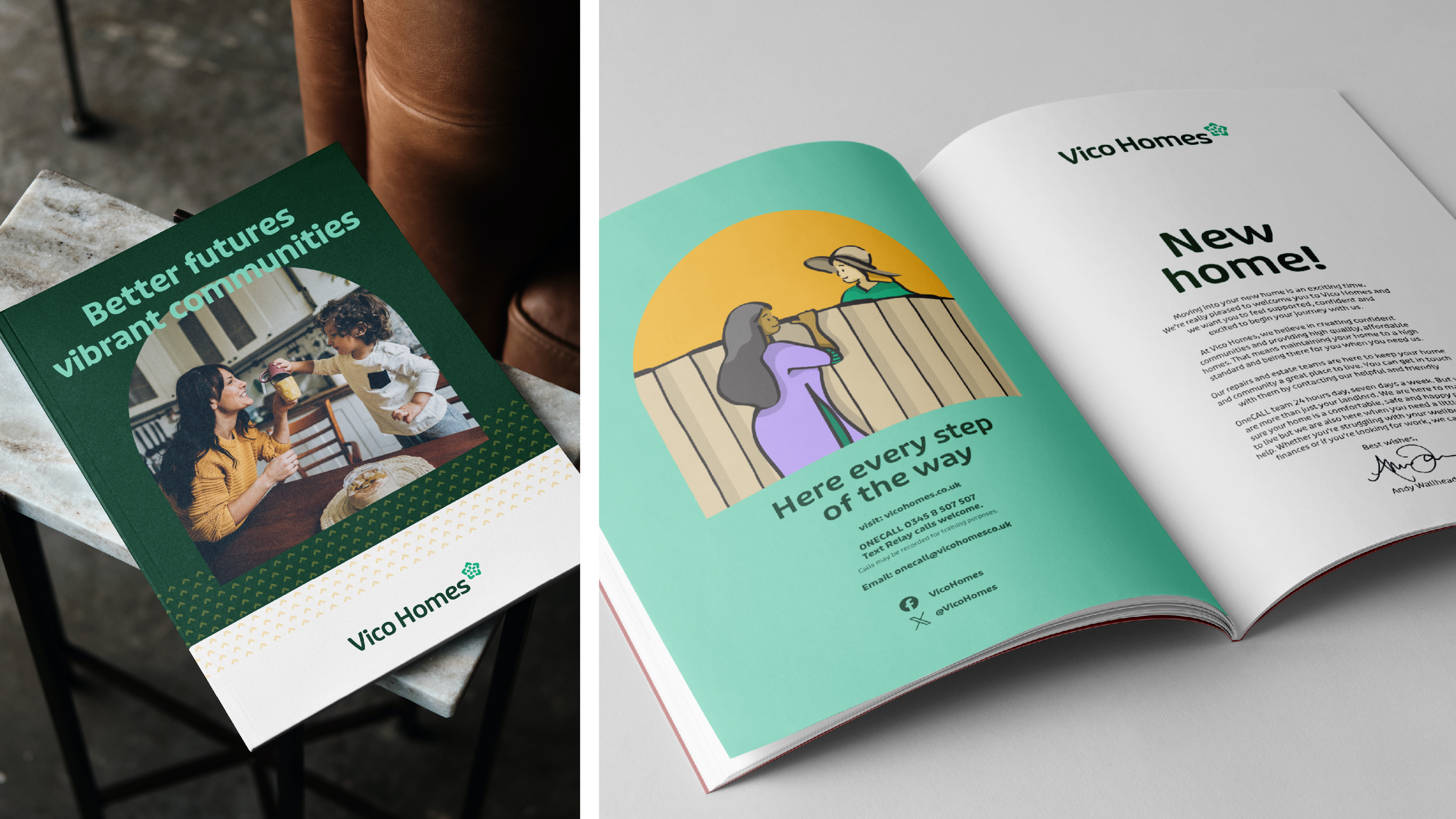
This provided the foundation for a new brand narrative with the idea of ‘Building Opportunity’ at its heart. This language enabled the brand to stretch across multiple roles from being a social housing landlord, to a provider of social and community support, right through to being a developer in its own right.
The brand needed to be both comprehensive and accessible. Involving users in the process made sure it became a usable audience-friendly tool to explain the new vision, ‘Better futures, vibrant communities’.
Working with the leadership team we explored the option of a new name as a clear statement of intent. After exploring multiple options, and involving staff in the process, Vico Homes was the preferred option, integrating the new vision (Vibrant Communities) into the name and making the subtle switch from talking about ‘housing’ to talking about ‘homes’, something that people internally already did naturally. This change enabled us to retain and reinforce the idea that they are serving their community, without being constrained by having the place name within their title.
Impact
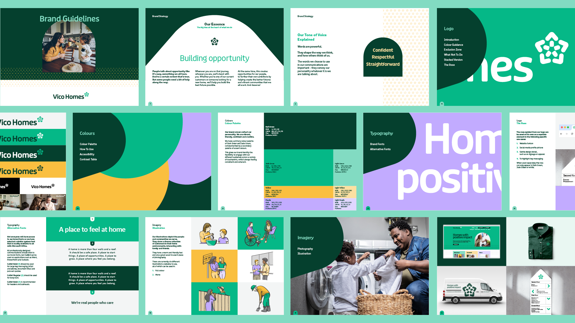
Key priorities for the visual identity were to create a flexible system to cater for their diverse audiences, to modernise the brand and to make it feel less distant.
Adopting a new, softer colour palette was a starting point. We retained some existing elements as secondary colours for consistency but adopted dark green and jade green as our primary colours. This made the brand seem more welcoming but also provided opportunities for impact.
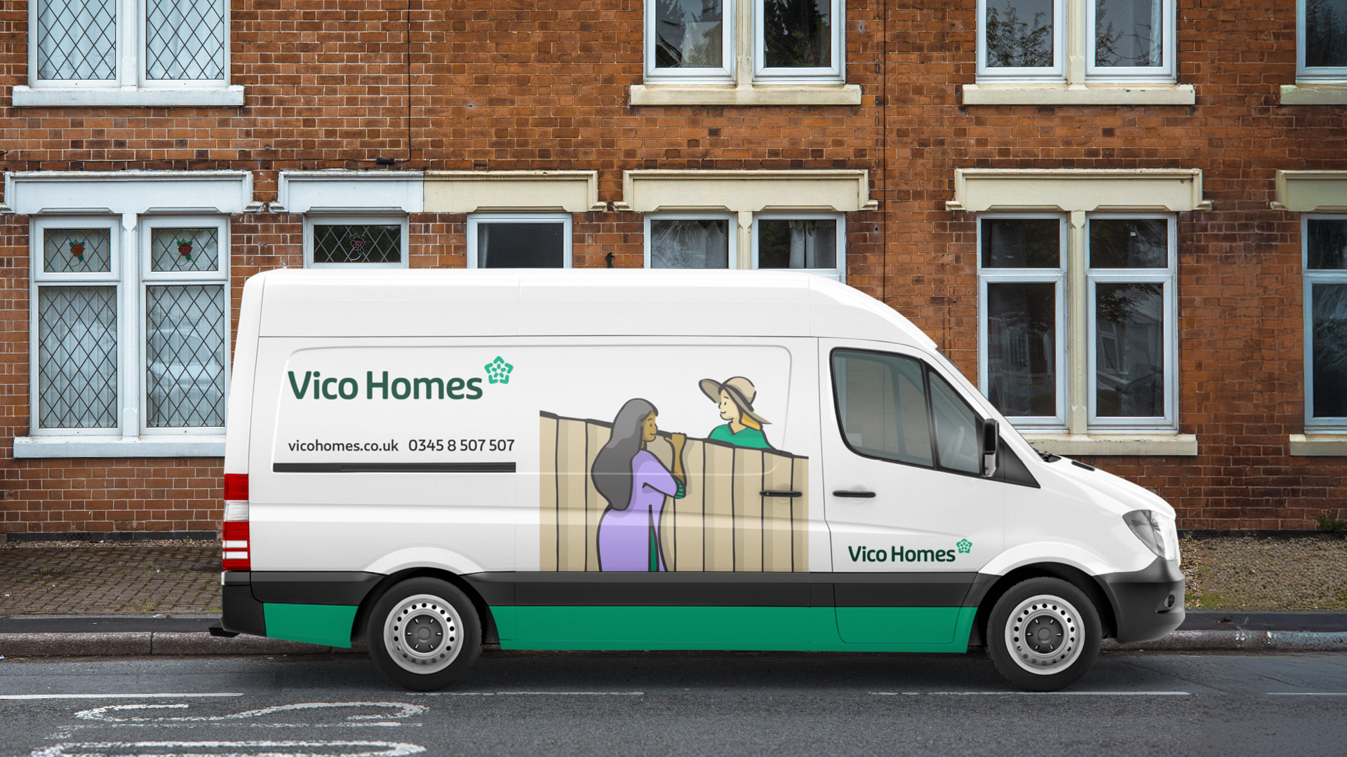
The logo, a modern evocation of the Yorkshire Rose, unpacks to become the start of a versatile visual language that illustrates key brand elements – home, people-centred, positive direction and community. These elements are then used further through a range of patterns to provide texture and depth to communications.
Within the wider system we used illustration to give the client maximum flexibility. This allows them to create communications where their diversity of customers can see themselves and to keep executions fresh without having to invest in a large image library.
Tone of voice guidelines bring to life the need to be confident, straightforward and respectful, enabling the brand to be used whether welcoming someone to their new home or dealing with customers in difficulty.
The brand has been enthusiastically adopted and the organisation have invested significantly introducing it to the team. As it has rolled out internally, people have taken the logo to their hearts, christening it ‘the bloom’, echoing the sense of personal and community growth at the heart of the brand.
This is a brand that will enable change within the organisation and positive impact on the people and communities they serve.