Formed in 2005, Better Cotton is a global network of over 2,700 members worldwide, working together to improve cotton farming production and align it to their own globally recognised standard. Today 22% of the world’s cotton is produced with Better Cotton, equating to over 2 million farmers producing over 5 million tonnes of Better Cotton. Their goal is for all cotton production to be aligned to their rigorous standards, so more smallholder farmer livelihoods are secure and thriving, and more cotton in the market is made to a higher standard.
With sustainability policy calling for more transparency & credibility of communications, Better Cotton’s farmers will now become certified producers of sustainable cotton. Our job was to create a new certification label, name and brand that works for new and current audiences, can flex with their current corporate identity, and aligns with the new legislation.
We needed to create language that conveys the same passion and drive its people have always had to transform the way the world’s cotton is produced, for the benefit of millions.
Insight
At its core, this project’s goal was to ensure that certification could be understood by everyone, and the brand would be seen as credible, impactful, relatable, and memorable. Through our consultations with staff, consumers, and members, we learned what “better cotton” means in their work; from farmers and ginners to global retail members.
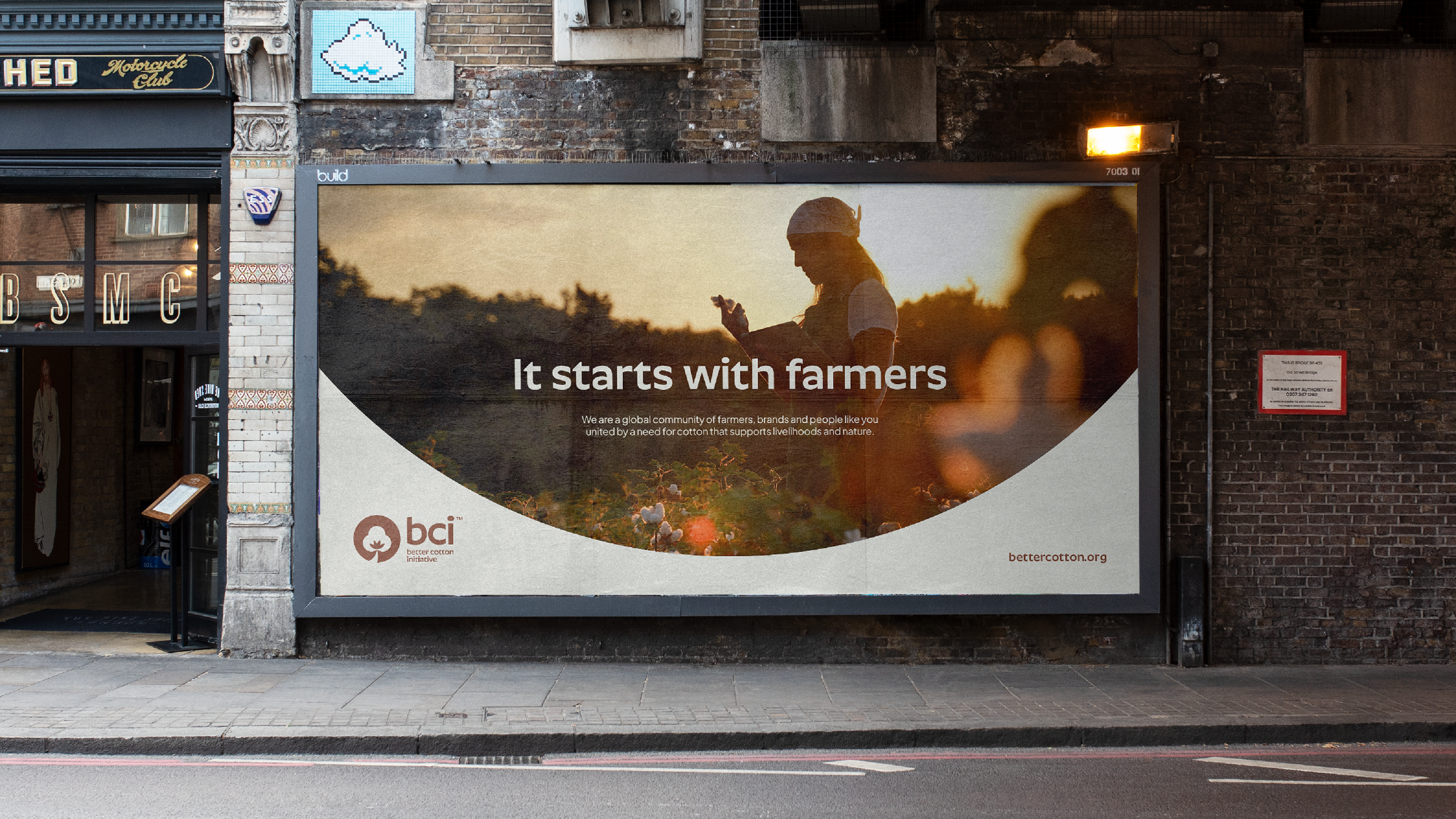
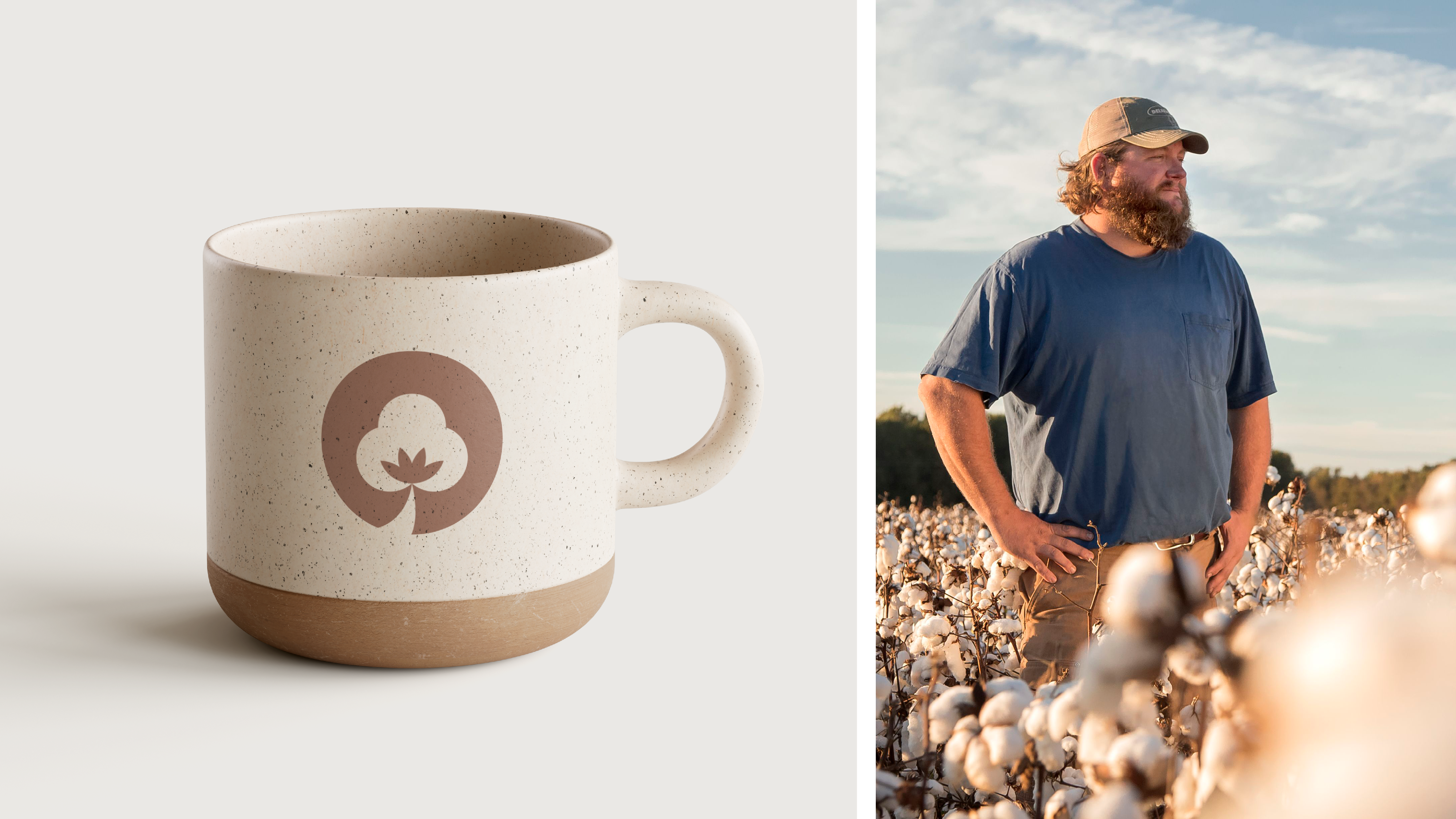
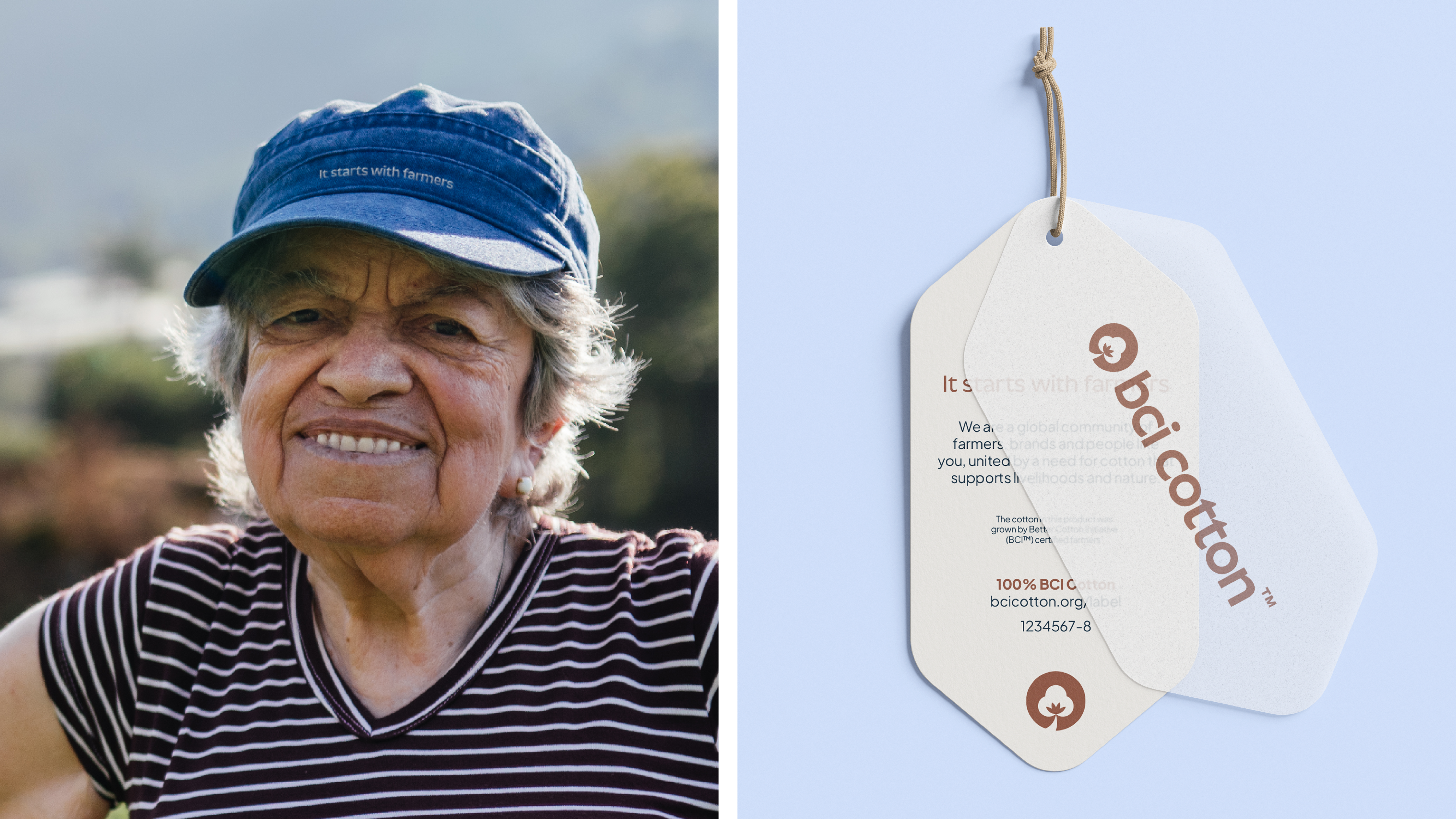
It was conclusive: It starts with farmers. Core audiences value Better Cotton for what they do with farmers. The resources, the approaches and the impact all begin with the farm and its farmers. The competition for space on a retail label is fierce, but we discovered an organisation with a robust reputation, using agricultural knowledge and practices that already go above and beyond existing certification models. All this packaged up into a unique membership structure that provides the security for global retailers looking to purchase cotton at scale. With this we defined their role as shaping an industry that puts farmers, communities and the environment first.
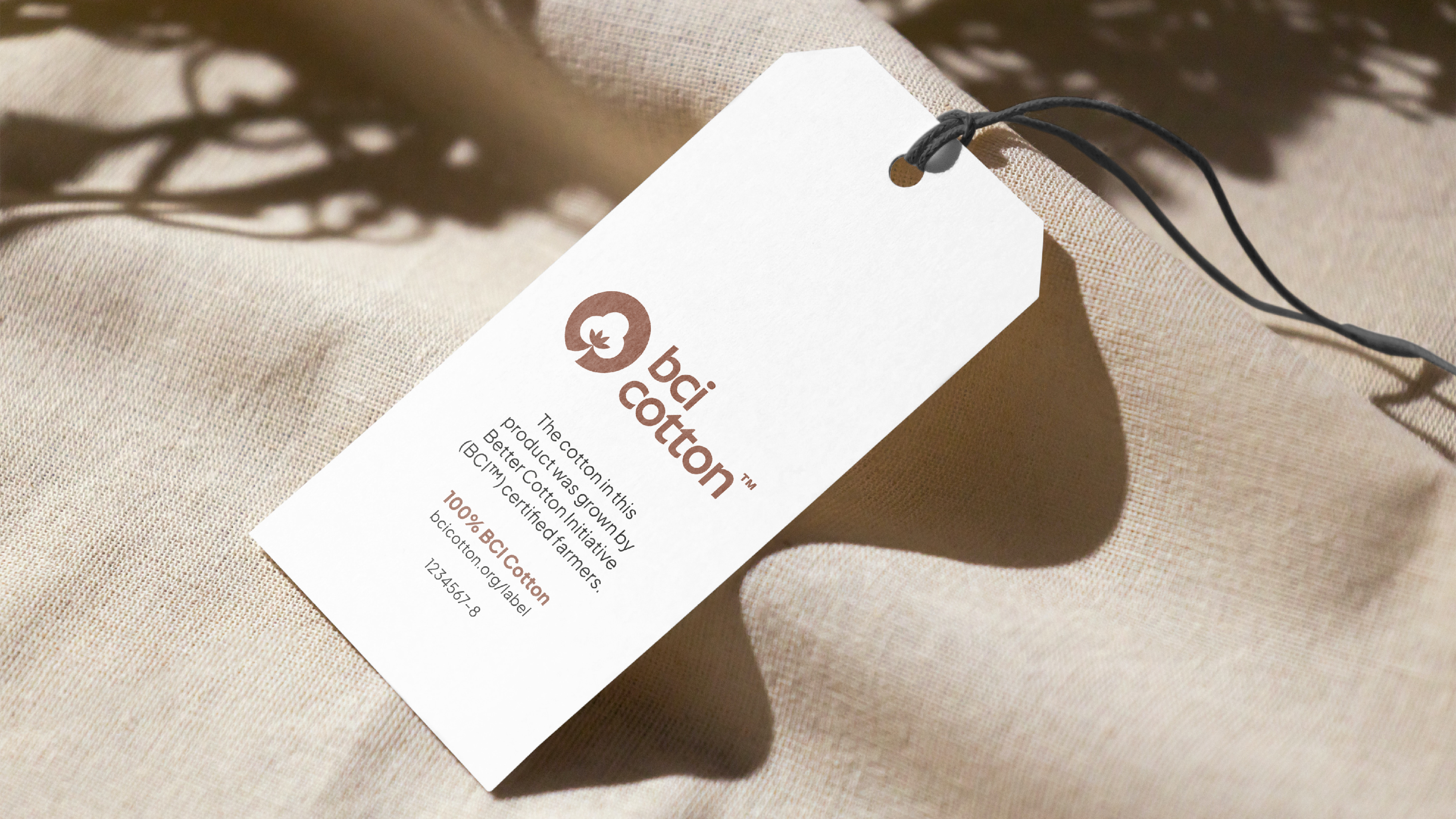
The final challenge at hand was to align our label name with our corporate name. There’s a lot in a name and adding or adapting it is no easy task. Except for Better Cotton.
Through our conversations and workshops, we found them being referred to consistently as the Better Cotton Initiative. Retaining this equity was important and, using evidence from external and internal testing we came up with two options: Better Cotton Initiative at a corporate level and BCI Cotton for consumer audiences.
Ideas
Better Cotton was coming into certification on a solid base, but we knew putting farmers at the centre of this story was key. It starts with farmers became the organising idea behind the label and new consumer-facing language.
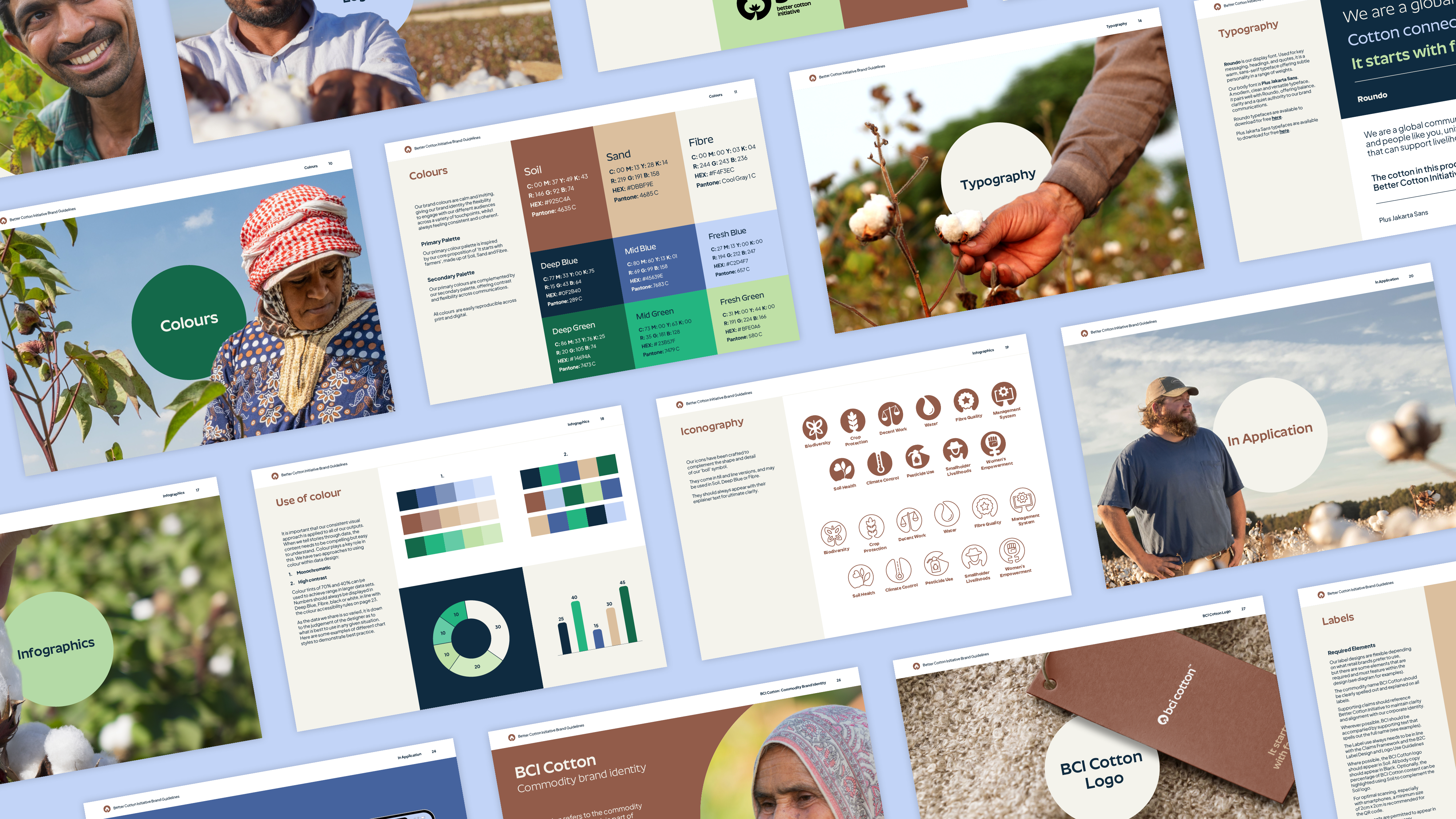
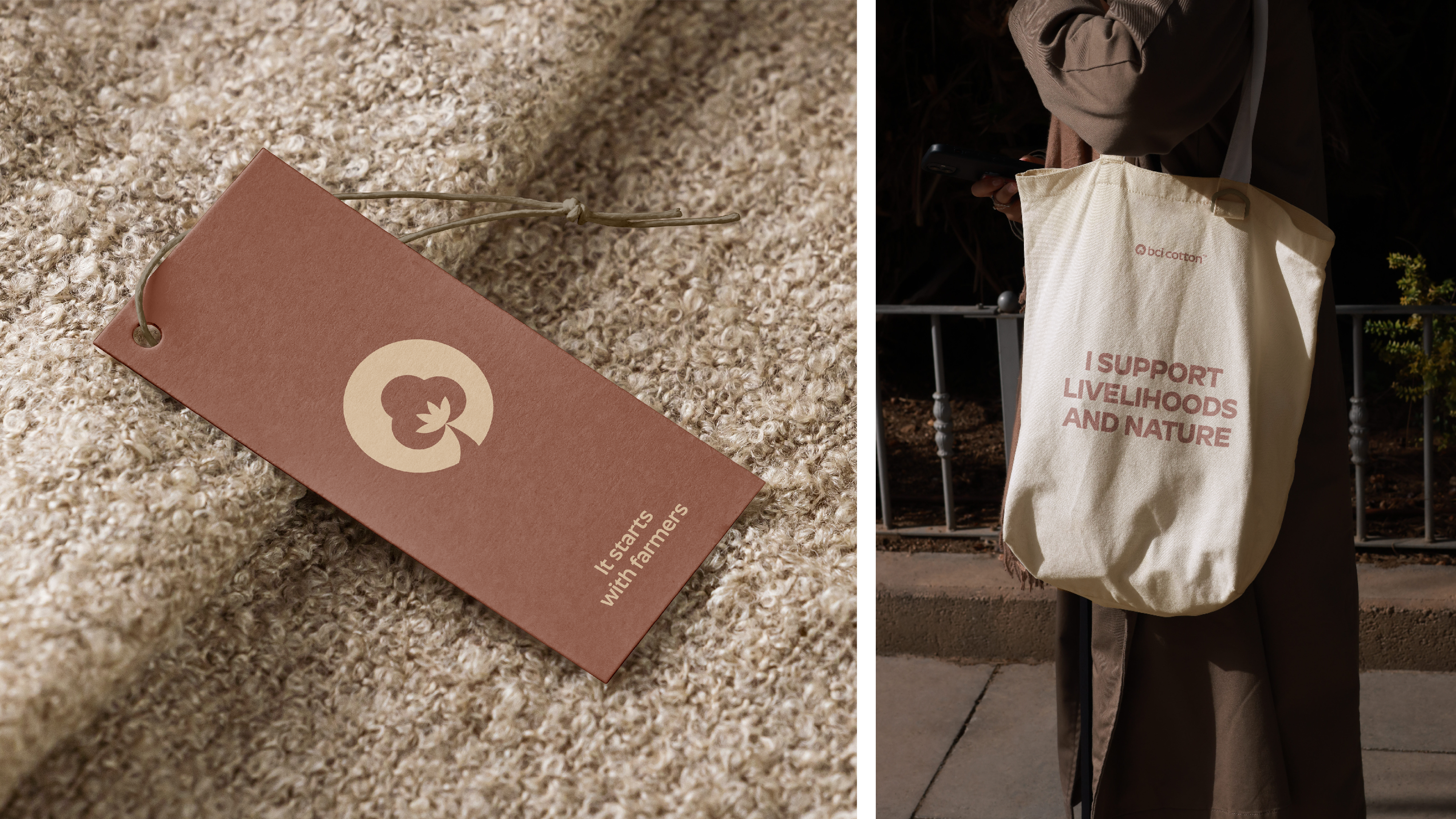
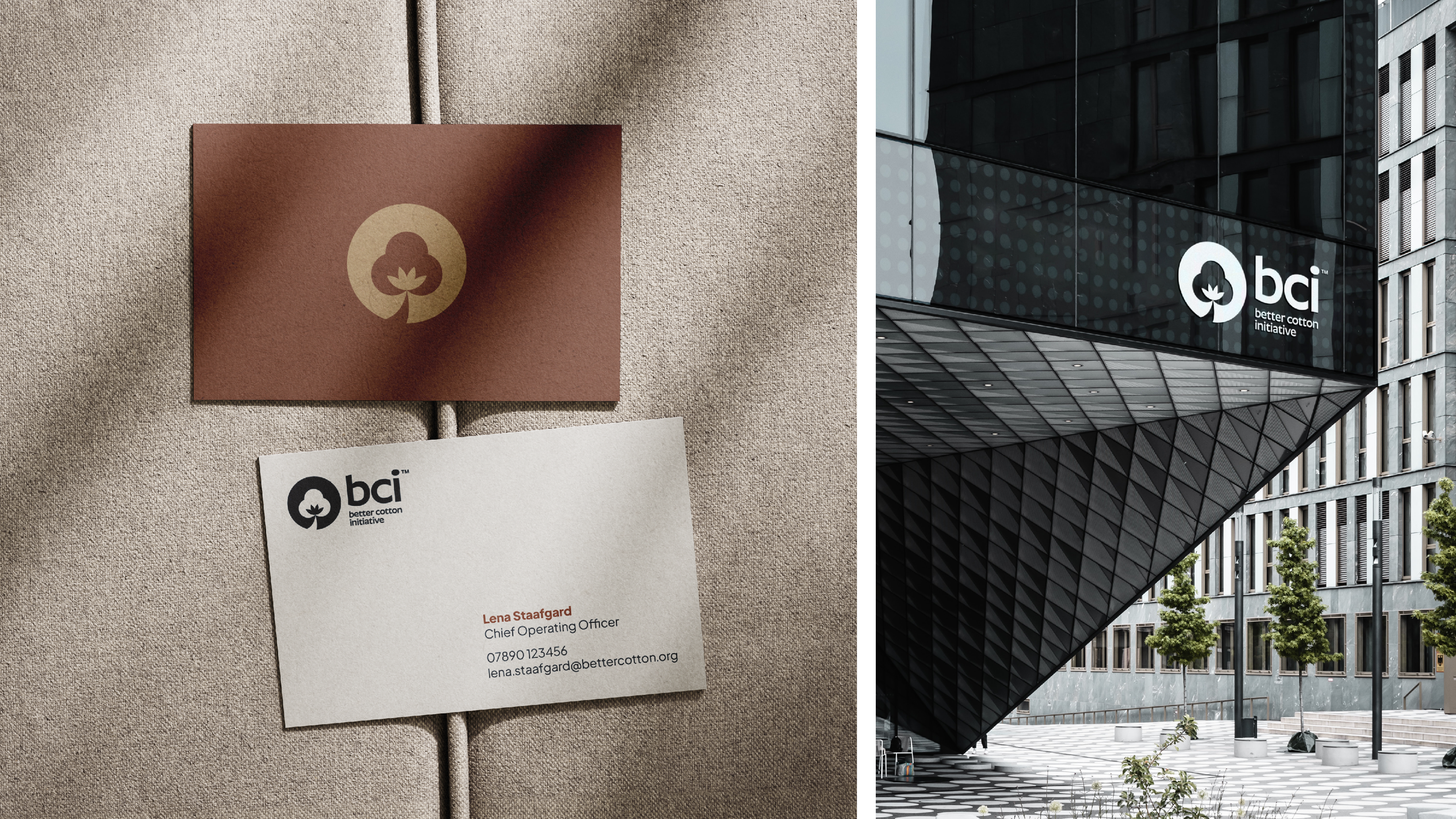
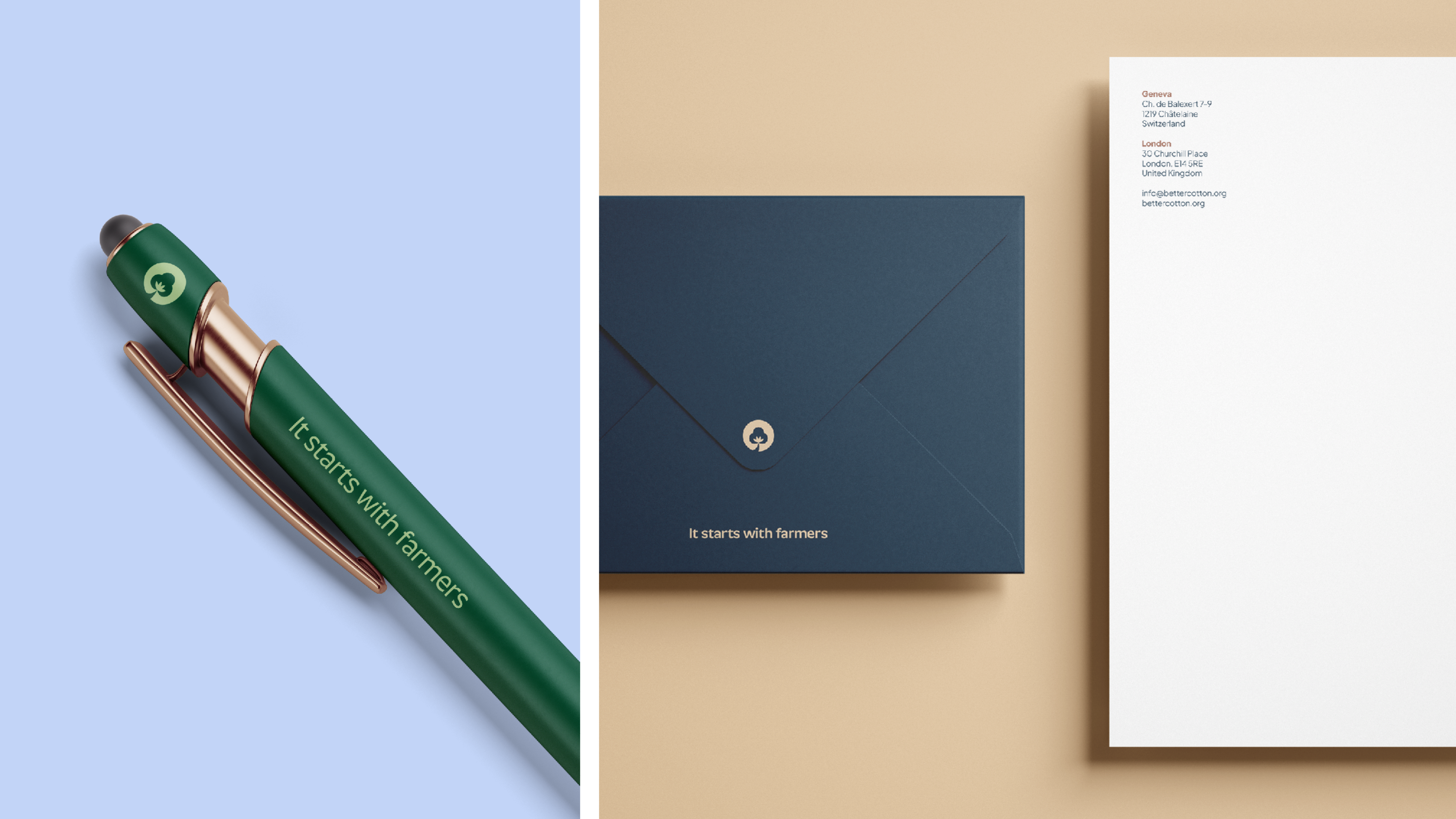
With their strategy firmly in place and a clear central idea at the heart, the visual identity needed to help this story rise to the top. They wanted to retain the equity in their existing ‘cotton boll’ icon, so we refined it and paired it with a more sophisticated typeface that would allow it to hold its own on a busy clothing tag.
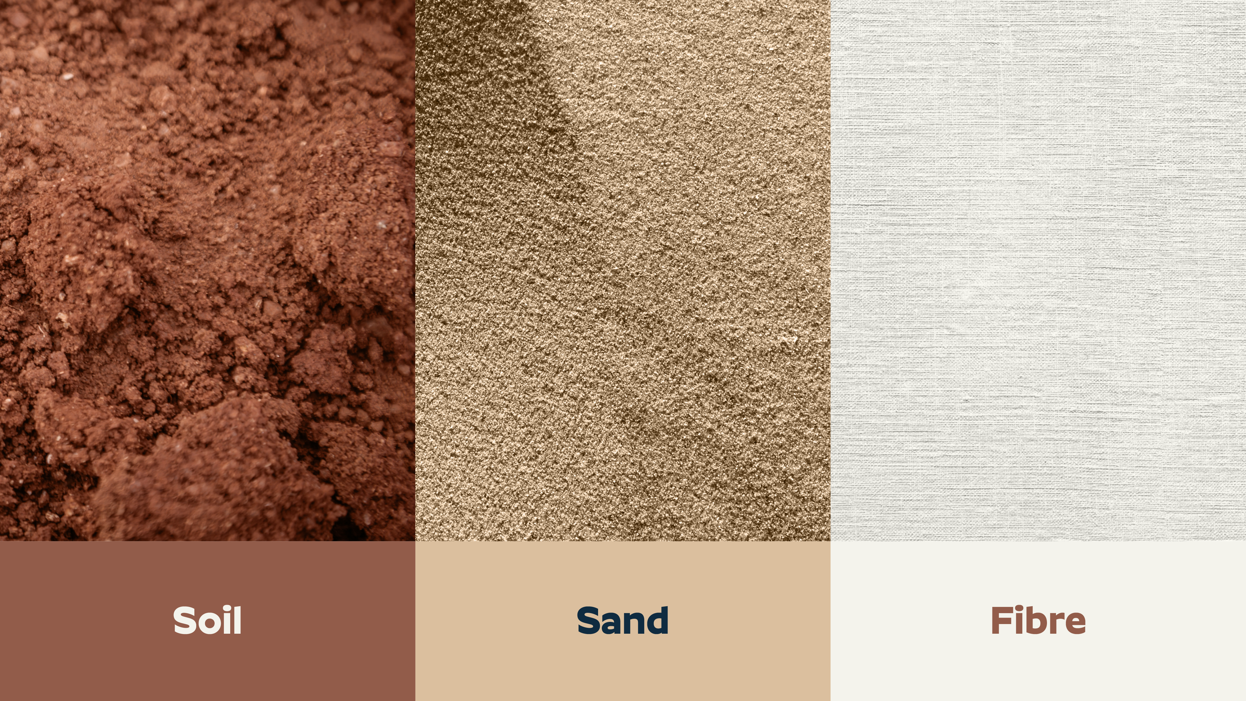
The new colour palette is rooted in natural tones, leading with Soil, Sand and Fibre. A direct visual link to the brand’s proposition that also holds some differentiation to the swathe of greens and blues that dominate the sector.
The logo typeface is also used as the display font, lending cohesion and impact to their key messaging. Paired with a clear, flexible secondary font, all the elements work in harmony across labels and communications to raise BCI Cotton up to the globally recognised certification body that they are.
Impact
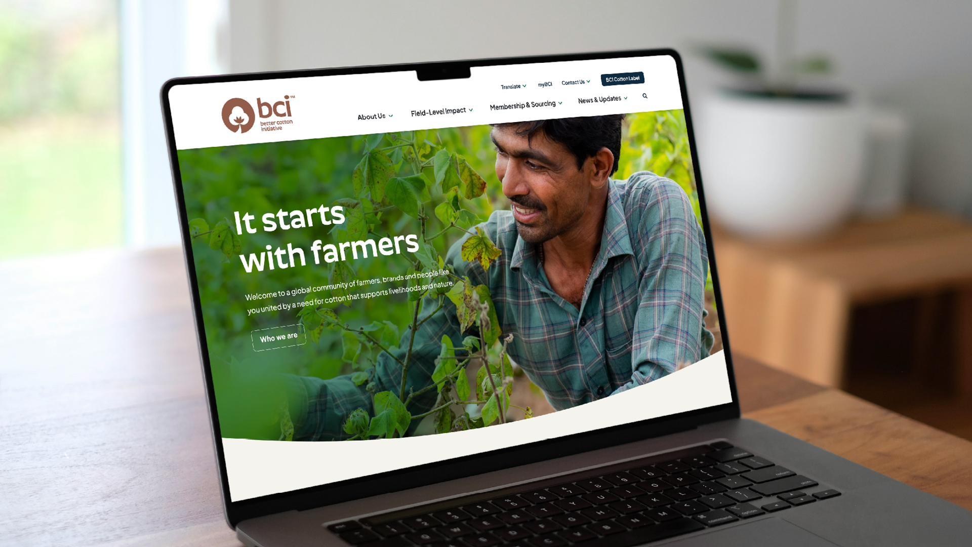
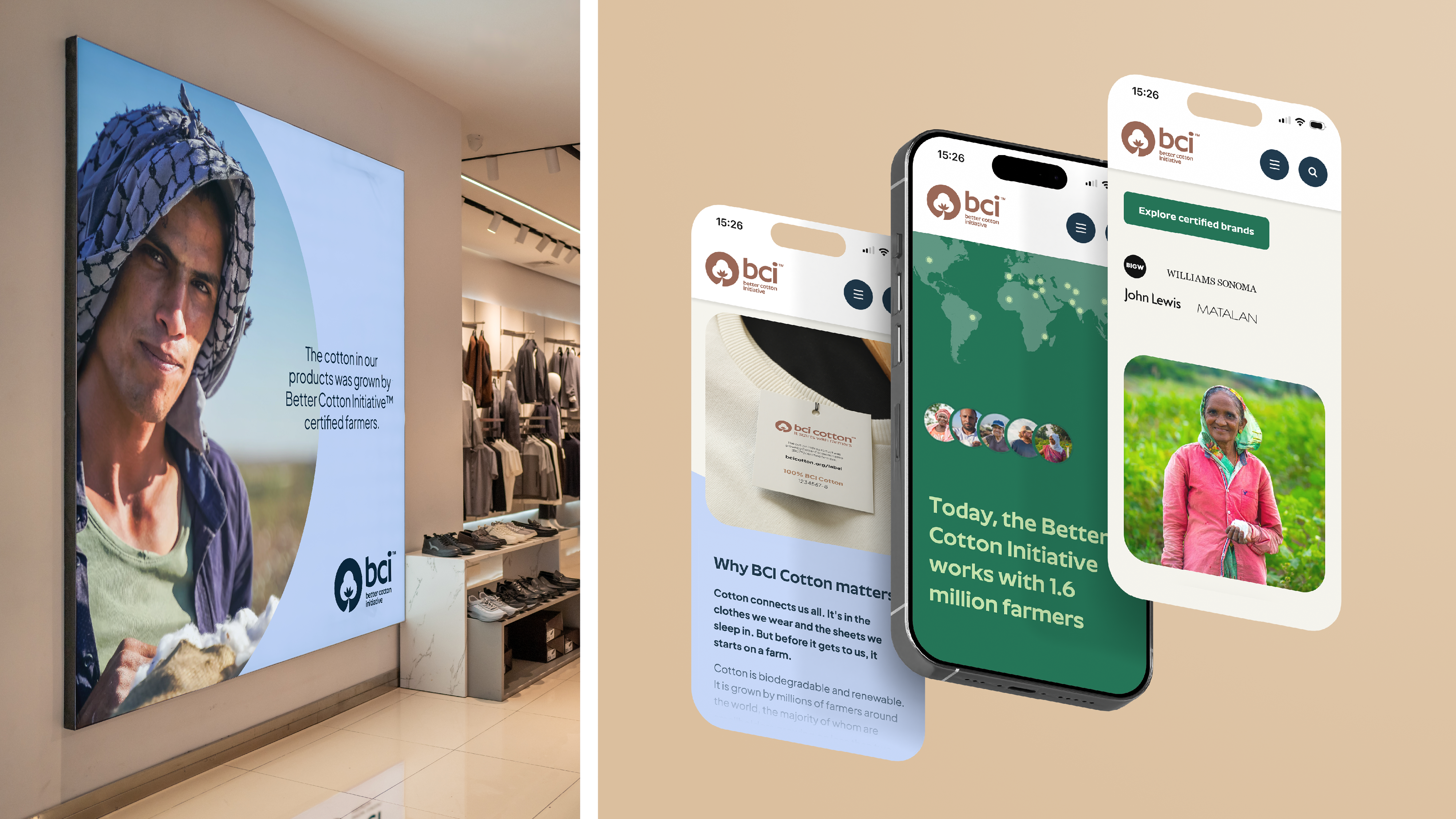
Working alongside our digital agency partner, we brought the new identity and narrative to life online — giving the website a fresher, more confident presence with the proposition pushed right to the forefront. And because the new label deserved a standout space of its own, we created the BCI Cotton Label page as its dedicated home, rolling the new visual identity across this page, the homepage and other key landing moments to maximise impact.
We have refined and clearly articulated their strategy for a new audience and equipped their team with the tools to launch the next chapter for the organisation. They have an identity that moves them beyond legislative requirements towards something that places their central purpose at the heart of their identity.
With BCI Cotton, they now have a consumer story that works with their existing brand narrative and enables them to tell their story to a new audience, setting them apart from competitors, and setting them up for their new future on solid footing.